The typefaces
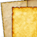
I have chosen my parchment paper. I like the one that feels the most warm and inviting.
Now I need to find a typeface for the words in the story. The typeface will need to go with the parchment background and the feel of an old fairy tale.
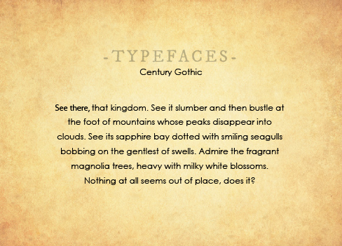
The first typeface I try, Century Gothic, is too modern looking, don’t you agree? Did you see the tip on typefaces? choosing-a-typeface
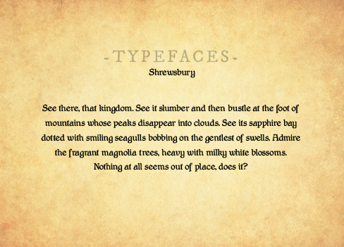
This typeface (Shrewsbury) feels good and old, but it is small and kind of difficult to read. Stories shouldn’t be hard to read. My job is to make them easy and pleasurable to read… Even though I like the way this looks, this typeface might, unfortunately, have to go.
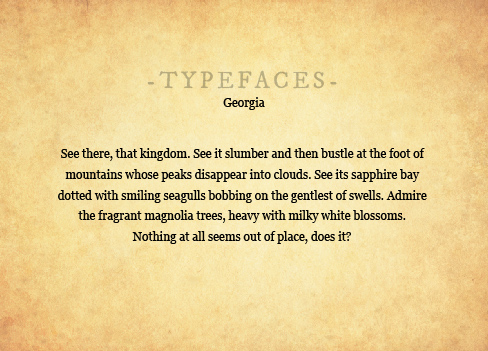
The third typeface I tried felt perfect. The typeface is called Georgia. It has an old-style and the full shapes of the letters makes it easy to read! But I am not satisfied yet… I want to add something more to the story text. Always notice when you feel like you haven’t yet finished the design…
I am going to pair Georgia with a another typeface to make The Waking Prince feel even more fairy tale. I will use this second typeface (which is called IM Fell) very sparingly. I will use it only on the most important words in a sentence, and maybe at the beginning of each story page. Using it sparingly makes it feel special and calls attention to any really special story text.
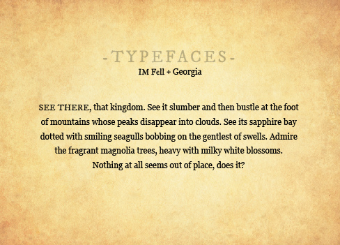
Remember, if you overuse a design element, it doesn’t any longer feel special or call the reader’s attention.
SEE THERE!